Access to Electricity: Data Visualisation
Development of an interactive web visualisation focusing on different levels of access to electricity to measure UN Sustainable Development Goal 7: Affordable and Clean Energy.
“How do we measure progress towards universal and clean access to electricity in the East-Asia Pacific region?” was the question our group aimed to explore in our data visualisation. Through analysis of various data sources of electricity access, economic power, and electricity sources in the region, we created an interactive data visualisation using D3.js to display our findings on a map.
I was involved in all phases of the project and was the main technical developer of the visualisation within a team, including analysis of data and coding it in D3.
To aid in our research on measurement towards this goal, we looked at data referring to one of the official United Nations Sustainable Development Goal Indicators: 7.1.1 Proportion of population with access to electricity. Our main data was found from World Bank open data on access to electricity as percentage of populations in urban and rural areas across 26 years (1990-2016). Supplementary datasets were also sourced from World Bank regarding electricity production from the region.
We looked at 4 different data points when analysing the data to understand access to electricity in the East Asia-Pacific region. These were:
overall percentage of population with electricity access
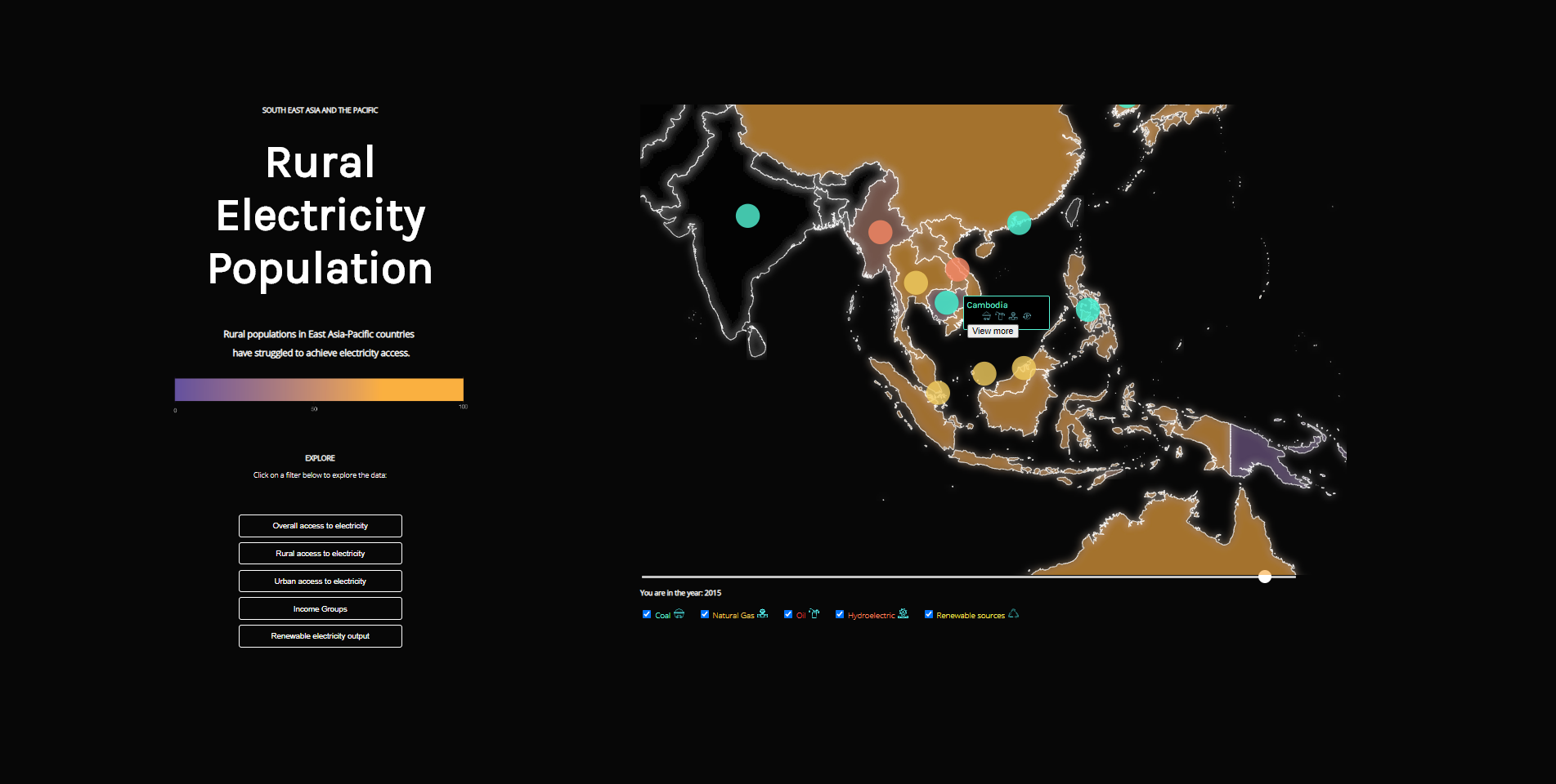
percentage of urban and rural population with electricity access
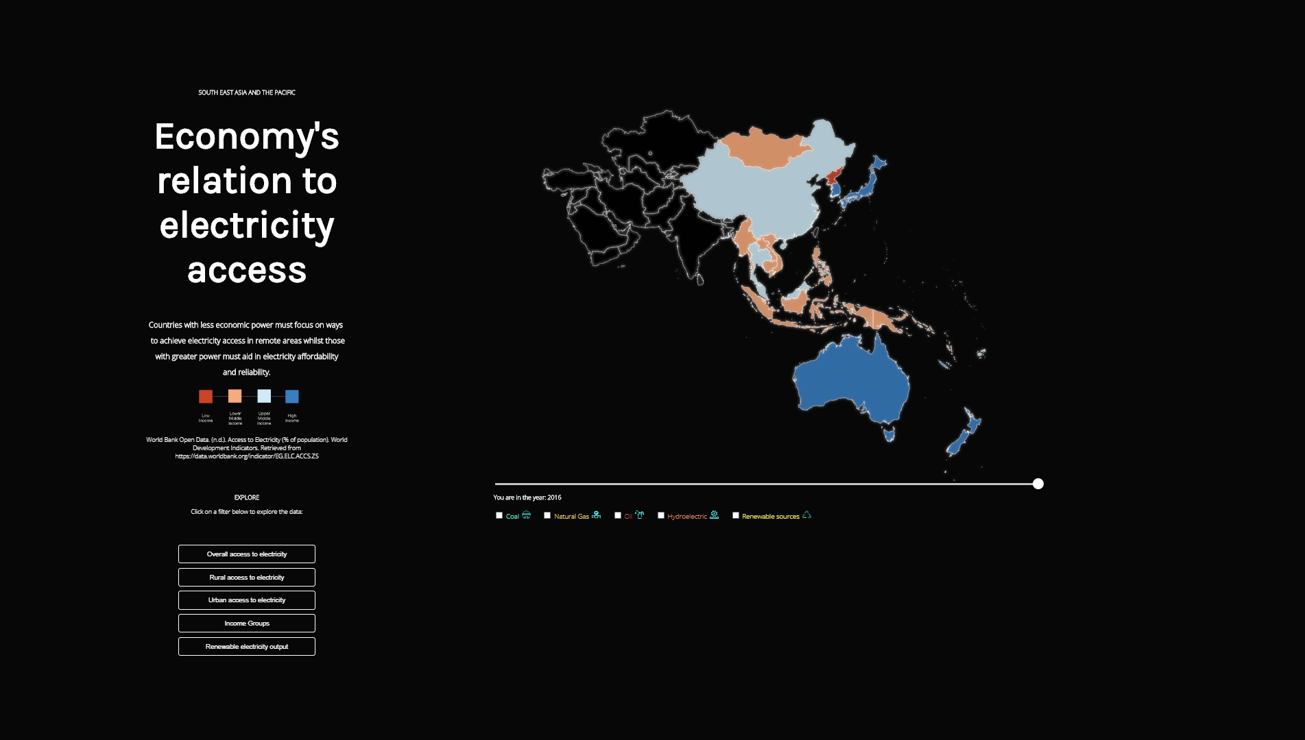
the income groups of the countries
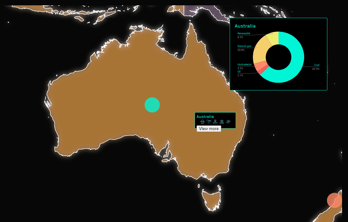
percentage of electricity production of different sources (coal, hydro, renewable, etc.) from the countries
The data in CSV form was analysed in Excel where I organised the data, created line graphs and column charts, and used mathematical functions to calculate number summaries for the data across the years.
The data for overall access, rural access, urban access and renewable output was then cleaned and saved into separate CSV files to be read into the visualisation using JavaScript.
Through our line graphs of urban and rural population access, it was clear that while access to electricity has increased for the people from 1990-2016, population in rural regions have inconsistent access. The rural population data was volatile with jagged lines, suggesting either that electricity access is inconsistent in rural areas or that data in rural regions are not recorded as consistently.
Comparing populations with access to electricity to their country’s income group saw many low-income countries having high or 100% access to electricity. Through internet research, this was surmised to be because or differing land sizes for electricity grid distribution and less dense populations.
Countries in the region mainly produce electricity through coal – an industry known for being pollutive and unsustainable due to high demands for mining and burning coal. Data tells that many countries have little to zero percentage of electricity output from renewable sources, which is crucial to achieve targets for cleaner electricity.
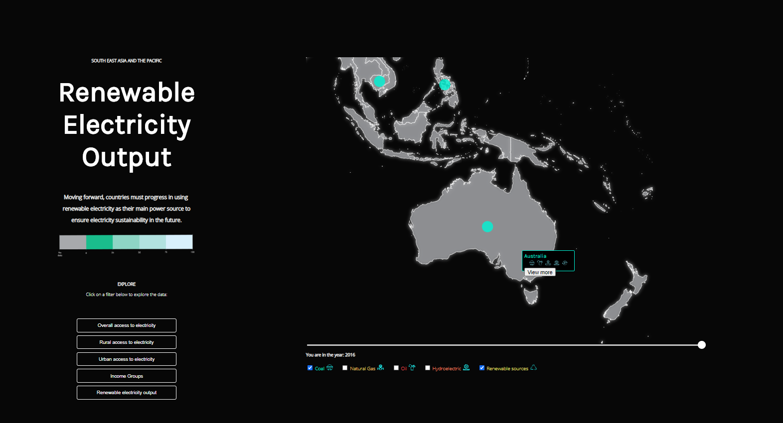
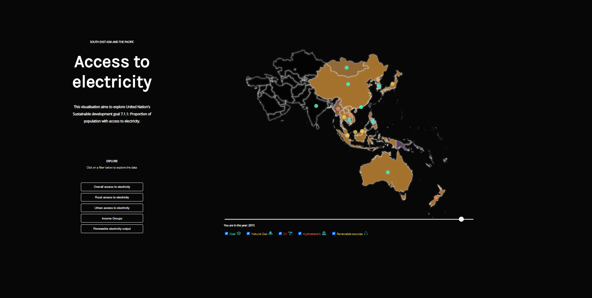
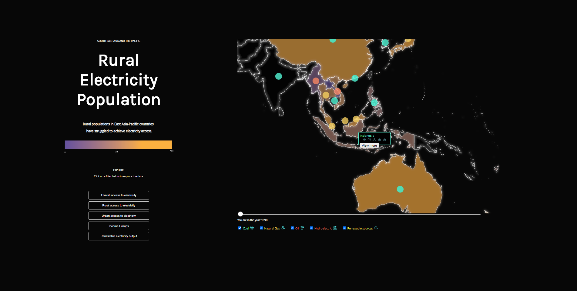
Our data visualisation is a zoom-able and interactive choropleth map of the region made using HTML/CSS, D3.js and JavaScript. Countries are highlighted with a glow outline and colour according its data value to simulate areas lit by electricity. Written summaries of findings were placed on the side where visitors can filter through different data points.

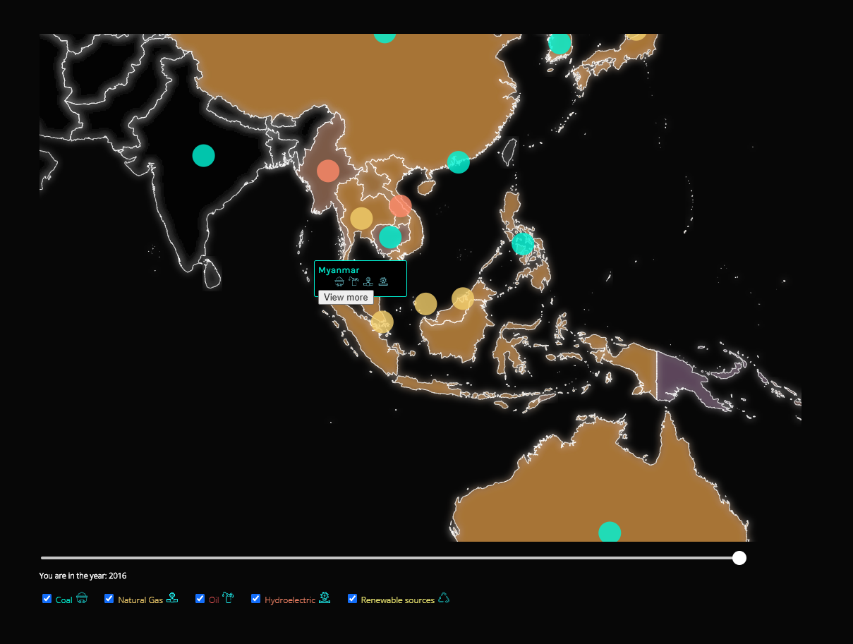
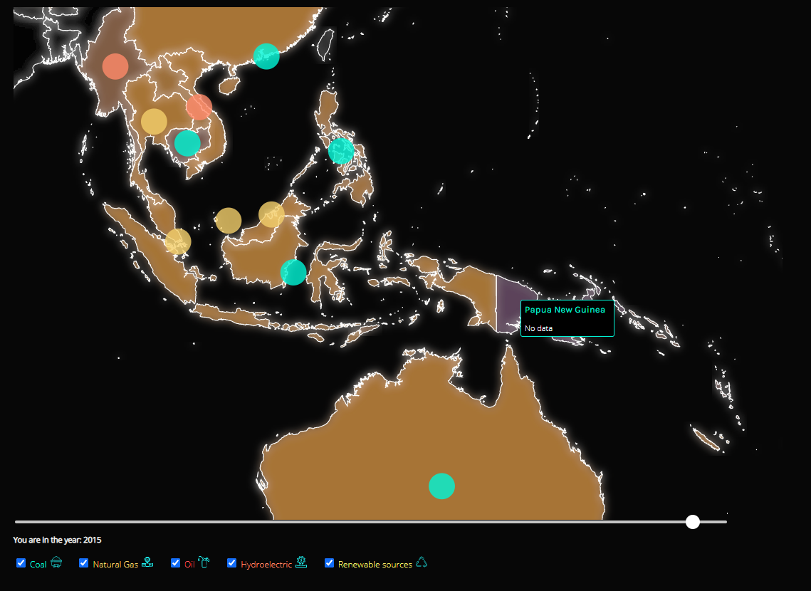 Coloured dots represent the country's main source of electricity as in the font colour of the checkbox filters below, which filters which countries use these sources for electricity production. Countries are selected through clicking on them where more details about their electricity production can be viewed. If there is no available data, it will be shown as above. Users can also use the bottom slider to filter through data across the years.
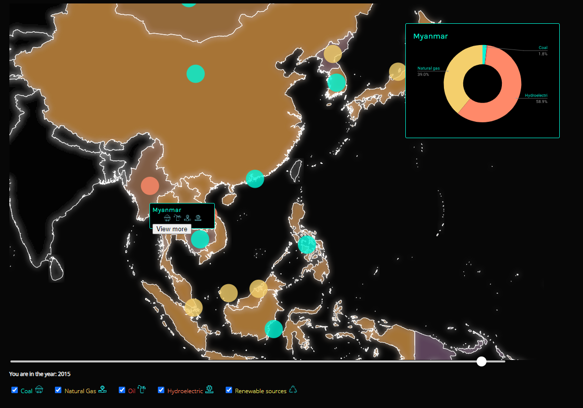 Clicking on view more will display individual country percentages on electricity source production as a donut chart.
The visualisation was able to portray our imported data insights in an aesthetic format. However, there are some limitations to the choropleth map method, including not being able to click or view small countries due to border thickness and the and the map projection used. As most countries already have high levels of electricity access, the differences of percentages using colour was subtle therefore the use of a complementary colour legend aimed to show more contrast between high levels and low levels. It was a technically challenging project but has given me new coding skills and really engaged in critically analysing what stories data can tell.